Featured products
-
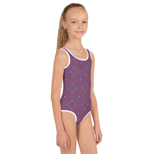
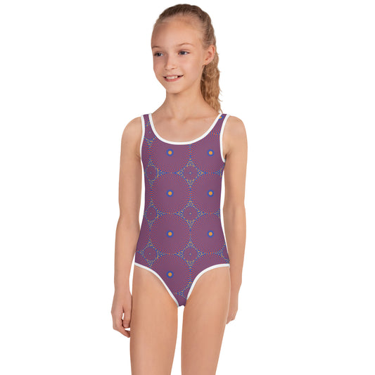
Bandama African Print Girls' Swimsuit
Regular price £35.00 GBPRegular priceUnit price per -
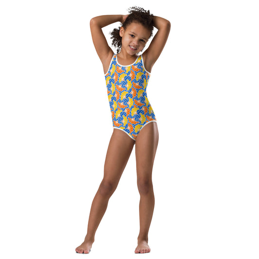
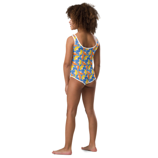
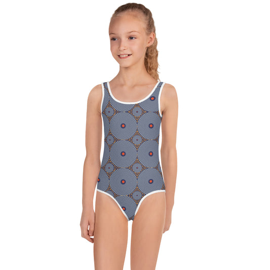
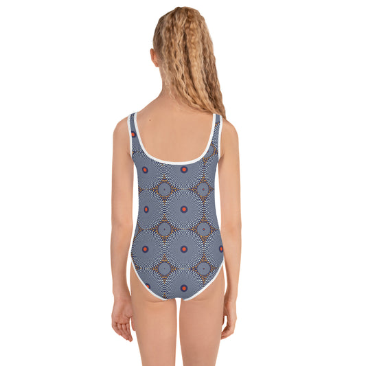
Cavalla African Print Girls' Swimsuit
Regular price £35.00 GBPRegular priceUnit price per -
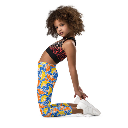
Cavalla African Print Kids' Leggings
Regular price £25.00 GBPRegular priceUnit price per -
Kolente African Print Girls' Swimsuit
Regular price £35.00 GBPRegular priceUnit price per